


David Peggie from the National Gallery Scientific department discusses Giovanni Bellini's use of the green coloured pigment malachite, in his painting 'The Agony in the Garden'.

A history of the colour green in art
Authors
By Evie Hatch
Green is a colour we instinctively associate with nature. In fact, the word ‘green’ in English shares the same root as the words ‘grass’ and ‘grow’.
Green is abundant in the natural world, but for much of history artists have struggled to find vibrant and lasting green pigments. While muted shades could be easily extracted from minerals and natural earth, bright and permanent greens were difficult to produce. The story of green in art is a story of adaptation and innovation.
Green earth
In some medieval paintings, certain faces appear to have an unusual greenish tinge. This phenomenon is the result of a traditional painting technique that used green earth, a pigment derived from natural clays and minerals.
Artists applied a base layer of green earth beneath pink flesh tones, a method inspired by Byzantine painters. This green underpainting helped neutralise the warm colours layered on top, creating more lifelike, natural skin tones. However, over the centuries, these red pigments have faded, revealing the green beneath.
The colour of the natural world
Traditionally a symbol of growth and renewal, green has the power to evoke the abundance of the natural world unlike any other colour. Wybrand Hendrik’s 'Fruit, Flowers, and Dead Birds' is alive with different shades of green, from the deep sage of the pineapple leaves to the pale gleam of the grapes.
The sense of life and vitality is sharply contrasted by the lifeless birds, delicately placed among the bristling flora. The abundance of green contributes to a powerful sense of the fleeting nature of life, a theme commonly explored in Dutch still life painting.
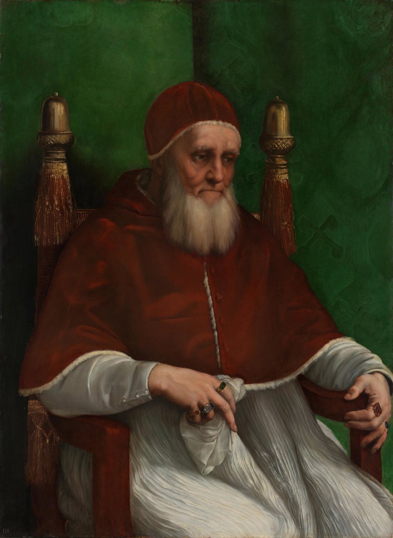
Green symbolism in Raphael's papal portrait
Red and green are complementary colors that, when placed side by side, intensify and enhance each other. In Raphael’s 'Pope Julius II', the striking green background behind the sitter enhances the richness of his red papal robes. However, this wasn’t the original vision for the painting.
At first, Raphael painted the background with a multi-coloured design with yellow, blue and white heraldic symbols. He later changed his mind and opted for the green that we see today. The choice wasn’t just aesthetic. Green was associated with hope and renewal, and it is echoed in the glittering emerald worn on the Pope’s index finger.
Fleeting greens
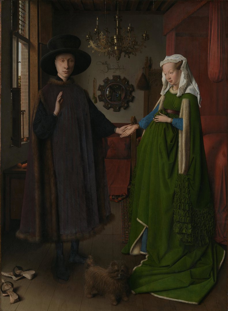
Throughout much of art history green pigments have been rare, and those that were available could be unreliable. A group of important pigments were copper-based greens commonly known as verdigris. Because they were transparent, verdigris-containing greens were often applied in jewel-like layers which added dimension and richness to the subject.
This technique, often used to depict green textiles, can be found in many great paintings from the past. One of the most iconic examples is the fine green woollen dress of the woman in 'The Arnolfini Portrait' by Jan van Eyck.
Regardless of how vibrant the colour once was, certain verdigris pigments go brown over time. The darkening effect can be seen in Dominico Ghirlandaio's 'Virgin and Child', where the green lining of the Virgin’s robe has degraded to an olive-brown colour. Cennino Cennini, the influential 14th century artist and writer, described verdigris as 'a most perfect green for grass… It is beautiful to the eye, but it does not last.'
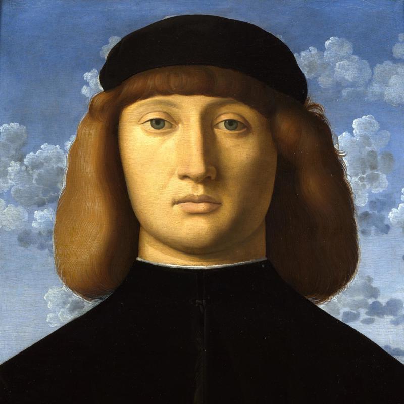
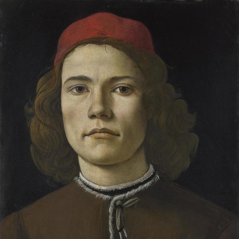
Another important pigment was malachite, a mineral that could be crushed and ground to make a green pigment. It was not an easy colour to work with. When the mineral was finely ground, it was very weak and pale, but coarser grades of the pigment were difficult to apply in layers. Malachite also had an unfortunate tendency to turn brown over time. The effect of darkened malachite can be seen in Giovanni Bellini’s 'Agony in the Garden'. Saint James’s cloak might look black today, but it was once painted green.
Mixing green
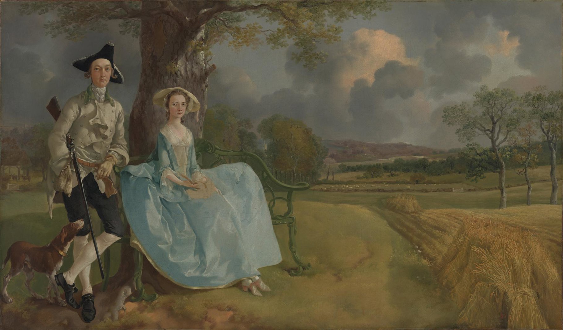
In the absence of reliable green pigments, many artists would mix the colour. Thomas Gainsborough was known for using complex combinations including blue, yellow, brown, black, and white, to produce green. These multi-pigment mixtures result in naturalistic, earthy shades of greens, like those in 'Mr and Mrs Andrews', which perfectly evoke the lush English countryside.
Green innovations of the 19th century
The 19th century was a period of rapid innovation in pigment production. For centuries, artists had relied on mixing greens with other colours, or using muted shades such as green earth, or unreliable verdigris and malachite. However, with the rise of industrial chemistry, new synthetic greens were developed, some of them brighter and more intense than anything seen before.
The most notorious of these was emerald green. Composed of copper arsenite, this pigment was extraordinarily vivid, with a brilliance unmatched by any previous green. It was inexpensive to produce and quickly became popular among artists. In 'Hillside in Provence', Paul Cezanne boldly applied streaks of pure emerald green, unmixed with other pigments, to make full use of its vibrancy.

However, emerald green had a dark side. It was not only used in artist's palettes but also in commercial products, including wallpaper and decorators's paints. In damp conditions, emerald green wallpaper could emit poisonous arsenic-containing gas, leading to widespread health concerns. Some historians even speculate that Napoleon Bonaparte’s death may have been accelerated by the emerald green wallpaper in his house on Saint Helena, where he was exiled in the final years of his life.
Emerald green wasn’t the only green pigment introduced in the 19th century – viridian and cobalt green were also new additions to the artist’s palette. With vibrant greens at their fingertips, the Impressionists painted greens in the landscape with a vigorous intensity that would have been difficult to achieve in previous centuries.

Widely found in the natural world, green is a crucial colour on the artist’s palette. However, for centuries artists needed to navigate the limitations of green pigments to achieve the shades they wanted, and today we often find muted browns where vivid greens once lit up the canvas
In the 19th century, advances in chemistry expanded their options and allowed for more vibrant, and stable, green hues. These innovations didn't just expand painters' palettes; they redefined how artists approached the subjects they were painting, allowing radical new techniques to reach their full potential in stunning shades of viridian, emerald and cobalt green. The natural world in particular could be captured in a striking new light.
You might also like...
A history of the colour blue in art
From opulent ultramarine to the vibrant blue hues of the Impressionists, discover the story of the colour blue.

A history of the colour orange in art
Discover the stories of orange pigments from Prehistoric cave paintings to the radical explorations of the Impressionists.
A history of the colour yellow in art
A colour that has captivated artists for centuries, dive into the world of yellow and its pigments.
A history of the colour red in art
Evoking a spectrum of intense emotions across history, explore how the colour red has been a powerful visual presence in art.
A history of the colour purple in art
Seasnails, royalty and 'Violettomania' – follow the stories of purple pigments throughout art history.
A history of the colour black in art
Dive into the history of black pigments, from ancient cave paintings to the present day.
A history of the colour brown in art
From the earth to the artist's palette, explore the significance of brown pigments in the National Gallery's collection.