

Travel with us beyond the sea to look at ultramarine, a pigment that was once even more precious than gold. Writer Victoria Finlay joins Beks for a discussion on how researching ultramarine took her to Afghanistan to visit the blue mines where the semi-precious stone lapis lazuli comes from.

A history of the colour blue in art
Authors
By Evie Hatch
Of all the colours in art, blue has been one of the most coveted, expensive, and symbolically powerful. While blue seems abundant in nature, in the sky and in the sea, natural blue pigments are remarkably rare.
Unlike red and yellow, which can be easily sourced from the earth, blue pigments have required expensive materials and complex processes to produce. The rarity of blue has shaped how artists have used it throughout the centuries.
Blue from beyond the sea
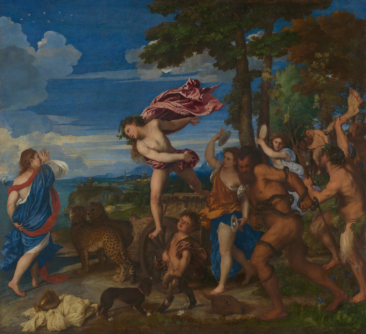
The most famous blue pigment in art history is ultramarine blue. Extracted from lapis lazuli, a semi-precious stone mined in Afghanistan, ultramarine was the most brilliant and stable blue available to artists during the Middle Ages, the Renaissance, and throughout the early modern period. Its name comes from the medieval Latin ‘ultramarinus' meaning 'beyond the sea’, expressing its distant origins.
Because lapis lazuli was difficult to acquire, ultramarine blue was incredibly expensive. The very best grades could be worth more than gold, and patrons commissioning artworks would often pay for the exact amount of ultramarine pigment they wanted used in the painting. In Pierre Mignard's painting of ‘The Marquise de Seignelay and Two of her Sons’, the Marquise wears a robe painted with a large quantity of high-quality ultramarine blue, ensuring that the viewer is in no doubt of her wealth and status.
Nowhere is the preciousness of ultramarine blue more evident than in its association with the Virgin Mary. Throughout European art history, Mary’s robes were often painted in rich ultramarine to signify her sacred status. One of the most eye-catching examples is Sassoferrato’s ‘The Virgin in Prayer’. When the painting was first acquired by the National Gallery, it was overpainted with cobalt blue to meet the Victorian taste for more muted colour. When the overpaint was later removed, the dazzling ultramarine blue beneath was uncovered.
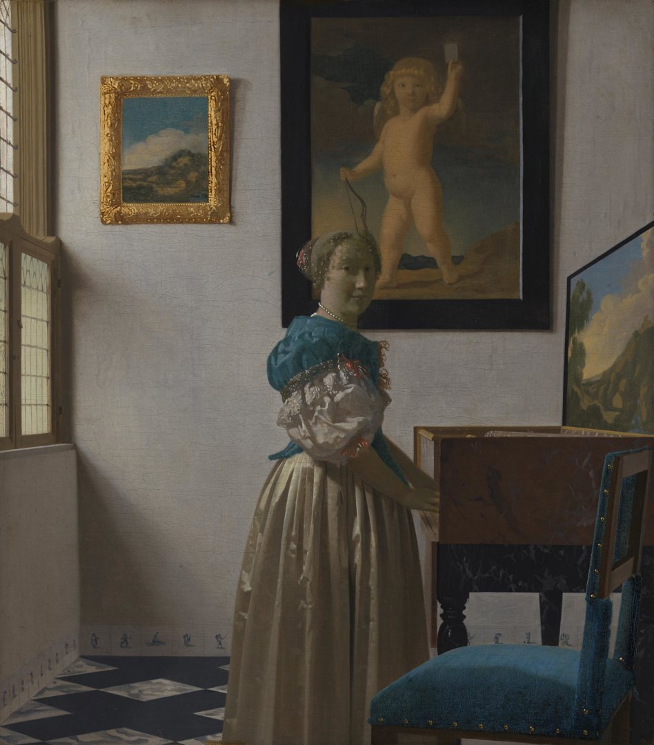
The great expense of ultramarine meant that it was often used sparingly to maximise its impact, but this wasn’t always the case. Dutch painter Johannes Vermeer was unusual in his extensive use of the pigment. In his domestic interior scenes, he mixed ultramarine blue with other pigments to paint upholstery, shadows, flesh tones, and even architectural elements like ceiling beams and windows. Vermeer’s use of the pigment throughout 'A Young Woman standing at a Virginal', not just in the most important areas, contributes to the colouristic harmony he is famous for.
The price of indigo
Anyone who has ever worn blue denim will be familiar with the colour of indigo. Before the development of synthetic indigo in the 19th century, the dye was extracted from the leaves of various plants. It was very highly valued, so much so that it was known as ‘blue gold’. In François-Hubert Drouais’ portrait, the Comte de Vaudreuil wears a luxurious indigo velvet jacket. On a map he points to Saint-Domingue (now part of Haiti), a French colony of which his father was governor.

There were thousands of indigo plantations on Saint-Domingue, which relied on the forced labour of enslaved people for profit. While the portrait of the Comte de Vaudreuil was intended to assert his status and brandish the source of his enormous wealth, it also serves as a reminder to us today that the history of indigo is tightly woven with that of colonialism, slavery and exploitation.
Vanishing blues
Indigo was not just a dye for fabrics, but also an important pigment on artist’s palettes. While it made a rich, dark blue for painters, it has not always retained its vibrancy on the canvas. In Cornelius Johnson’s ‘Portrait of a Lady’, the sitter once sat before a rich blue background, but the indigo pigment used to paint it has since faded to grey.

Another unstable blue pigment was smalt, a cobalt-based glass pigment used from the 16th to 18th centuries. Over time, smalt tends to lose its blue intensity, shifting toward a dull brownish-grey. The sky in Paolo Veronese’s ‘The Dream of Saint Helena’ may look overcast today, but it was once a pale blue.

A revolutionary discovery: Prussian blue
After centuries of working with expensive or chemically unstable blues, there was a major breakthrough in the early 18th century with the accidental discovery of Prussian blue, likely made by German paint maker Johann Jacob Diesbach.
It was not only more affordable than ultramarine but also far more intense than indigo or smalt, making it an instant favourite among artists.
One of the earliest adopters of Prussian blue was Canaletto, a master of Venetian cityscapes working in the 18th century. He frequently mixed Prussian blue with white to create his expansive skies and was so reliant on this new pigment that he reportedly delayed commissions when he could not obtain it.

The 19th century: Blue for the Impressionists
The 19th century saw rapid advancements in pigment technology, which revolutionised the way artists used blue. One of the most significant innovations was the introduction of cobalt blue. This pigment, first developed in the early 1800s, provided a strong blue that rivalled the vibrancy of natural ultramarine.
Impressionist painter Pierre-Auguste Renoir was particularly fond of the new pigment. In ‘The Skiff (La Yole)’, the river is painted with strokes of pure cobalt blue, made even more striking by the bright orange of the boat. The Impressionists, fascinated by colour theory, often used complementary colours in this way to heighten the intensity of their paintings.

Perhaps the most significant breakthrough was the creation of synthetic ultramarine. In the 1820s, chemists discovered a way to produce a pigment almost identical to natural ultramarine but at a fraction of the cost. This invention had a profound impact on art, making what was once the most luxurious blue an everyday staple of the artist’s palette.
Claude Monet embraced the new blue pigment, but he often used it subtly rather than as a dominant hue. In ‘Lavacourt Under Snow’, he used synthetic ultramarine in the underlayers of the snow field, burying the pigment under layers of lead white and cobalt blue.
It marks a profound shift from the way that ultramarine was used in the past; the pigment was once a grand, symbolic statement, but in the 19th century its new-found affordability meant that it could take a step back in the artist’s palette.

The story of blue tells of the lengths that artists and chemists have gone to capture it. From the opulent ultramarine derived from lapis lazuli to the modern vibrant blues used by the Impressionists, it has evolved from an elusive, precious colour reserved for the most sacred and prestigious works, to an accessible and versatile staple of the artist’s palette.
You might also like...
A history of the colour yellow in art
A colour that has captivated artists for centuries, dive into the world of yellow and its pigments.

A history of the colour orange in art
Discover the stories of orange pigments from Prehistoric cave paintings to the radical explorations of the Impressionists.
A history of the colour red in art
Evoking a spectrum of intense emotions across history, explore how the colour red has been a powerful visual presence in art.
A history of the colour green in art
A look at the history behind the symbolism of green and its various pigments in the National Gallery's collection.
A history of the colour black in art
Dive into the history of black pigments, from ancient cave paintings to the present day.
A history of the colour brown in art
From the earth to the artist's palette, explore the significance of brown pigments in the National Gallery's collection.
A history of the colour purple in art
Seasnails, royalty and 'Violettomania' – follow the stories of purple pigments throughout art history.