Why do we see purple as the colour of royalty? It all starts on the Mediterranean coast with some unassuming seasnails. Travel back to ancient times with colour specialist Victoria Finlay and National Gallery host Beks Leary to trace the story of Tyrian purple.

A history of the colour purple in art
Authors
Think of the colour purple and what springs to mind? For many it’s associated with royalty, power and luxury. It’s a colour that is relatively rare in nature, and you might also notice that it’s relatively difficult to spot on the walls of the National Gallery. But why is that the case?
Purple or violet?
You might notice that purple and violet get used quite interchangeably as colour terms, but there is a slight – but significant – difference. Violet is part of the visible spectrum of light, so you can see it in a rainbow, while purple is non-spectral. This means that unlike violet, purple does not have its own specific wavelength of light – instead, it is perceived through a combination of blue and red wavelengths. In terms of colour mixing, purple refers to colours closer to red on the colour wheel, while violet tends to be closer to blue.
Where do purple pigments come from?
The colour purple has been used in the form of dye for millennia, but its origins are less glamorous than its use would suggest. Unlike pigments and dyes which have their origins in gemstones such as lapis lazuli, azurite and malachite, the purple dye known as Tyrian purple originates from mucus produced by sea snails in the Murex family.
Despite its slightly unsavoury origins, the dye was said to be worth three times its weight in gold in Roman times. It was also incredibly rare, and an astonishing amount of mucus was required to make a tiny amount of dye. The colour was so revered that it was strictly reserved for emperors and kings. In 40 AD the King of Mauretania was assassinated on the orders of Caligula, and there are many rumours as to why. One suggests that he dared to show up in Rome in a purple cloak. The creation and spread of Tyrian purple stopped when Constantinople fell in 1453, signalling the end of the Eastern Roman Empire.
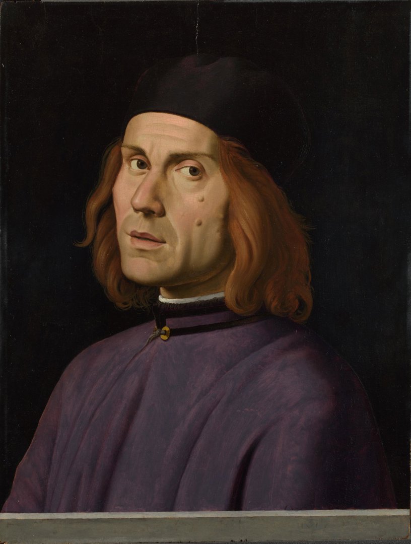
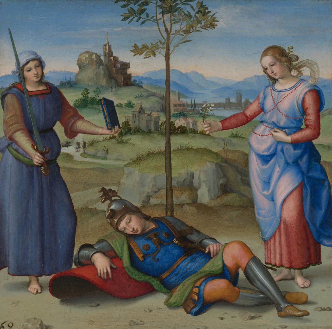
So how have artists captured Tyrian purple robes in paint? In ‘The Dream of a Knight’ Raphael depicts a scene from an epic poem by the Roman poet Silius Italicus. In this scene a knight faces a moral dilemma – he must choose between Virtue and Pleasure. In Silius’s poem, Pleasure is described as a woman wearing a shining robe of Tyrian purple embroidered with gold.
At first glance, Raphael’s Pleasure seems to be wearing an overdress that is perhaps more pink and blue than Tyrian purple. With the fading of a red lake pigment in the pinkish-mauve areas of the overdress, it is possible that Pleasure’s robes may have originally appeared more purple in colour.
It wasn’t until 1856 that a synthetic alternative to Tyrian purple was discovered, accidentally, by William Perkins who was working as a student of August Wilhelm von Hofmann at the Royal College of Chemistry. He was trying to synthesise quinine, a natural product sought after for its antimalarial properties.
While he didn’t succeed in his goal, Perkins instead discovered how to make the purple dye, mauveine. He soon realised how lucrative his discovery could be, leaving his research behind to commercially manufacture the dye. It was so popular that purple became the height of fashion in Paris and London in the late 1850s and early 1860s, with even Queen Victoria choosing to wear a mauveine dress.
Purple continues to be a colour associated with royalty to this day. When Her Majesty, Queen Elizabeth II, died in 2022, Vogue UK printed a commemorative issue with a simple, purple cover.
Where did artists get purple from?
So how did artists use this colour, so synonymous with power and royalty, throughout history? And how was the pigment developed for artists?
The earliest examples can be traced back to Neolithic artists, who would use hematite and manganese. They would either use the materials as sticks or ground, powdered and mixed with fat to create a paint. Hematite appears as a red/brown pigment at first, but when ground coarsely it creates a purple tone.
A pigment known as Han purple was used in Chinese art for hundreds of years, and despite its name, its use began well before the Han dynasty. It was created using a variety of minerals to produce a deep, rich blue-purple colour, and can most commonly be seen on ceramics or glass. Its use seems to have stopped in around 220 BC.
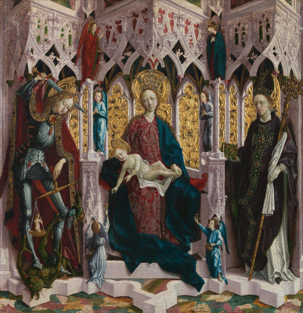
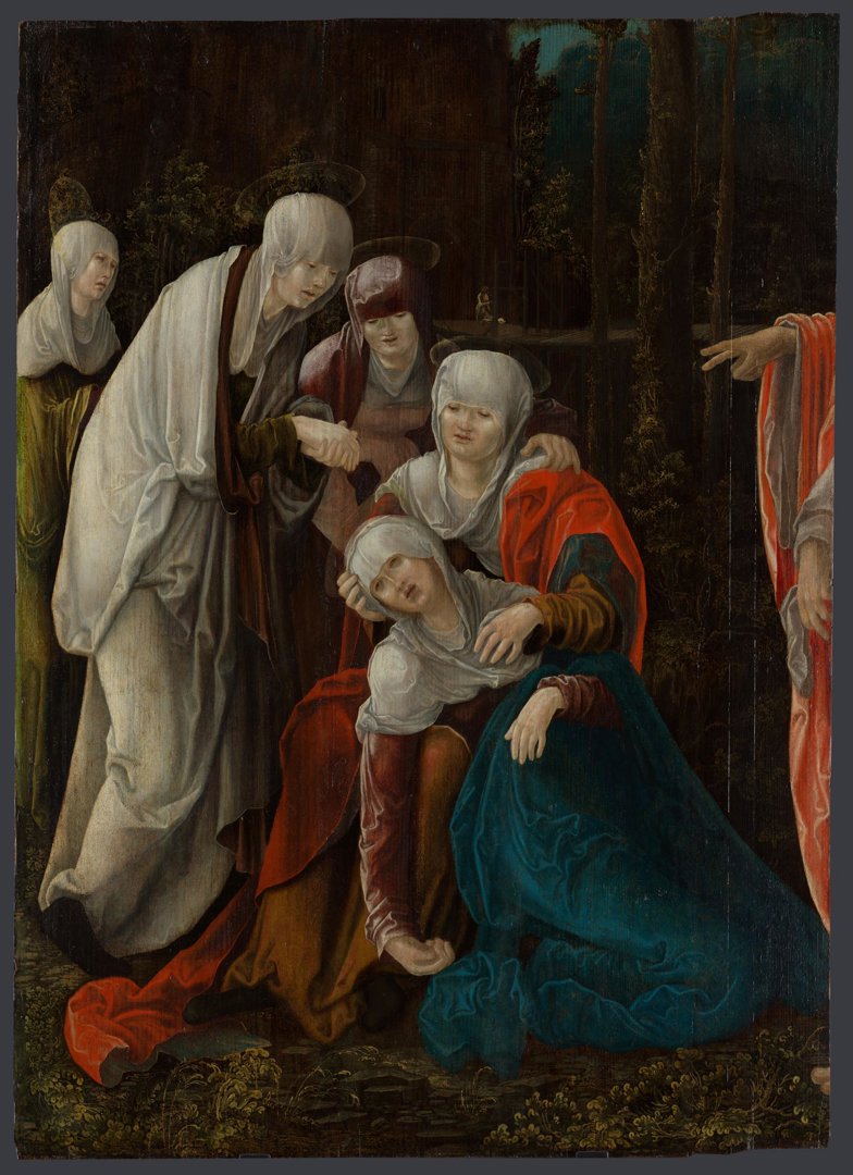
In panels, sculpture and wall paintings from Tyrol or Southern Germany in 1470-1520, National Gallery scientists have been analysing the presence of fluorite (calcium fluoride). This incredible specific use of the chemical is due to the fact it was extracted locally and was a by-product of mining for other materials. Purple fluorite in particular was used as a pigment relatively rarely, and in paintings from this very specific geographical area.
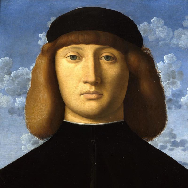
A selection of works that contain the pigment can be seen in the Gallery’s collection, including this work probably by Michael Pacher, ‘The Virgin and Child Enthroned with Angels and Saints’. Look closely at the architecture behind and notice the greyish-purple colour that Pacher used. He was working in Bolzano in the Tyrol. This painting is unusual as the pigment was mixed only with white and used in the uppermost paint layer.
Another example is Wolf Huber’s ‘Christ taking leave of his Mother’, where the pigment was used in the drapery of the Holy Woman second from the left.
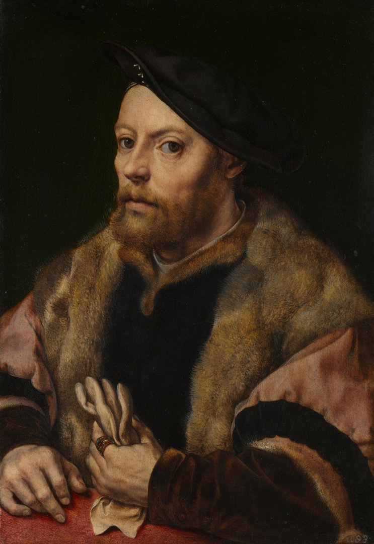
Other works to use the pigment include paintings from the Netherlands, such as Jan Gossaert’s ‘A Man holding a Glove’. The pigment is less present in these works, and it is thought that perhaps these artists came across the pigment while travelling to Italy.
How did purple reach the masses?
So far in the history of art, purple has proved a tricky and very localised pigment to source, its connotations with wealth and status linked to its challenging origins.
It’s a secondary colour. This means it can be created by mixing red and blue, so you do not need the pure pigment to add purple to an artwork in the way that you would if using one of the three primary colours.
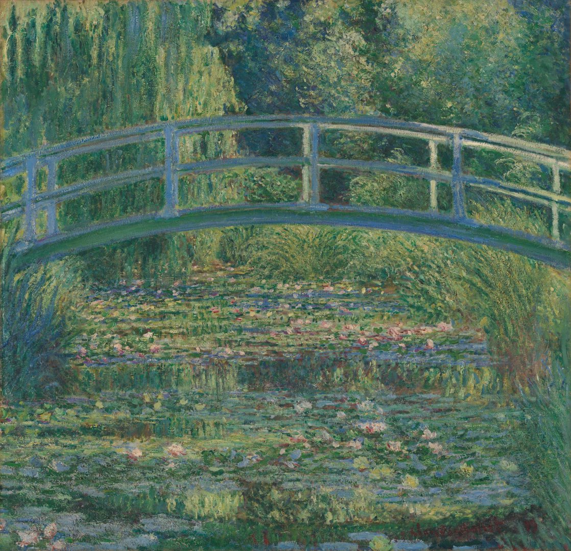
In 1859, cobalt violet pigment was invented, with manganese violet following in 1866. Cobalt violet was first created by a French chemist Salvetat, though it was expensive to make and quite a weak pigment, so not instantly popular with artists. As with many pigments, it is also slightly toxic. Manganese violet is made from manganese chloride, phosphoric acid, and ammonium carbonate, and this pigment became incredibly popular with the Impressionists. Claude Monet in particular preferred to use violet instead of black, as seen in his water-lily series.
The Impressionists were such fans of these new pigments that it caused critics to recoil in horror and accuse them of ‘Violettomania’. The artists loved how these new shades helped them to capture the light in their works.
Other artists who were enraptured by purple include Gustav Klimt and the Pre-Raphaelites such as Sir John Everett Millais and Arthur Hughes. A love of purple continues into the 20th century, with artist and Andy Warhol’s friend, Isabelle Collin Dufresne, going so far as to change her name to Ultra Violet, a reflection of one of her preferred hair colours.
From the robes of Roman emperors to the Victorian royal dress collection, the history of the colour purple has often been intertwined with that of the elite. Considered a rarity for hundreds of years, today it is still heavily connected to royalty, yet artists have also harnessed its interesting shades to create striking works and dazzle audiences in new ways.
Lily is a former Content Producer at the National Gallery and has always been fascinated by the stories in art history. She’s an artist and crafter, often taking inspiration from the Gallery’s collection in her work, and when not thinking about art she can be found in the world of music and horticulture.
You might also like...
A history of the colour black in art
Dive into the history of black pigments, from ancient cave paintings to the present day.
A history of the colour red in art
Evoking a spectrum of intense emotions across history, explore how the colour red has been a powerful visual presence in art.
A history of the colour blue in art
From opulent ultramarine to the vibrant blue hues of the Impressionists, discover the story of the colour blue.
A history of the colour green in art
A look at the history behind the symbolism of green and its various pigments in the National Gallery's collection.

A history of the colour orange in art
Discover the stories of orange pigments from Prehistoric cave paintings to the radical explorations of the Impressionists.
A history of the colour brown in art
From the earth to the artist's palette, explore the significance of brown pigments in the National Gallery's collection.
A history of the colour yellow in art
A colour that has captivated artists for centuries, dive into the world of yellow and its pigments.