Episode 94
The National Gallery Podcast
As ‘ Making Colour’ continues, we get up close to some of the world’s rarest pigments. Plus, a luminous pastel by Rosalba Carriera.
11 min 32 sec | August 2014
MIRANDA HINKLEY (in the studio): This is the National Gallery Podcast and I’m Miranda Hinkley.
First, a visit to ‘Making Colour’, the Gallery’s exhibition exploring the dazzling array of pigments artists have used over the centuries. Leah Kharibian met up with Ashok Roy, the National Gallery’s Director of Collections and co-curator of the show, to find out more about the history of one particular part of the colour spectrum -- yellow and orange. They took a look at a 17th century depiction of 'Saint Cecilia' by Pietro da Cortona, where the patron saint of music wears a luminous orange gown and a vivid blue mantle lined with yellow. As Ashok Roy explained, these colours are a curious mixture of old and new.
ASHOK ROY: The clear blue colour is lapis lazuli ultramarine, just like the early pictures that we have in the show. But the yellows are a really new introduction to painting, and they only came into use fully in the 17th century. They were actually coloured materials that were developed by ceramicists to decorate the kind of ceramics that are called ‘maiolica ware’. And that technology of colouring ceramics was transferred to the painter’s palette and that’s what we’re seeing here.
LEAH KHARIBIAN: That’s wonderful, you’ve got some very beautiful examples of maiolica ware in the exhibition, including a beautiful plate with a decorated deep-orange and blue rim. When artists saw these, they must have gone ‘wow, I’ve got to get some of this colour into my painting’. Is that how it happened, is that how the transfer of colours took place?
ASHOK ROY: I think that’s a very interesting model of how it might have taken place, but we don’t really know what happened. But the manufacture of ceramics in the 16th century was quite widespread in Italy and there were painters who were decorating ceramics, who were really quite good painters in their own right, so one imagines a community of artists who were working on ceramics… may have known painters of easel pictures and that kind of connection probably brought the materials together between these two creative industries.
LEAH KHARIBIAN: And so what happens to orange, this wonderful colour that we have in 'Saint Cecilia', we know is a mixture isn’t it, of yellow and red, but does orange turn up as its own pigment at any point?
ASHOK ROY: There are not all that many pure orange pigments available to early painters, but there is a very interesting mineral, quite rare, called realgar and we have in the exhibition a painting by a Dutch flower painter called Rachel Ruysch and she has used realgar as a pigment to depict the large lilly, orange lilly, at the centre of the picture. One interesting thing about this material is that it’s exceedingly poisonous and so painters had to, you know, beware in their use of it – there’s a sort of health and safety issue there.
LEAH KHARIBIAN: So when it comes to the story of orange and yellow it’s sort of the arts of fire on one hand and poison on the other. I suppose artists are actually… maybe we should re-evaluate them as intrepid pioneers?
ASHOK ROY: Well, one thing I think ‘Making Colour’ tells us is that this has been a long struggle for painters to find the right sort of materials to use in their pictures and they went to all kinds of different lengths and trouble to ensure that their paintings would survive over the ages and they were very interested in the stability of the colours and so this was always an issue for all painters at all times.
MIRANDA HINKLEY (in the studio): With thanks to Ashok Roy.
MIRANDA HINKLEY (in the studio): As the ‘Making Colour’ exhibition reveals, artists traditionally created colour by mixing raw ingredients into paint by hand. The process fell out of fashion with the advent of industrially manufactured paints in convenient tubes in the 19th century. But it’s still possible to buy ground and powdered pigment if you know where to look.
Just a short walk from the National Gallery, the artists’ suppliers, Cornelissen and Sons stocks jar after jar of different colours. Yanko Tihov, artist and former manager of the shop, showed Cathy FitzGerald a few of his favourites. He began with Indian Yellow, now so rare it’s a museum piece and not for sale - a good thing given the nature of its production - which was said to involve distilling the urine of cows fed on a diet of mango leaves. Cornelissen’s own a large glass jar of this historic pigment. At first sight it’s underwhelming: dark mustardy chunks of colour. But as Cathy discovered it’s not as innocuous as it looks...
YANKO TIHOV: The colour becomes apparent once you start grinding, so it’s not what you see as a lumpy form; it gets much brighter, earthier.
CATHY FITZGERALD: … a much brighter, earthier yellow.
YANKO TIHOV: Yeah, you could actually see little bits of the brightness of it more inside.
CATHY FITZGERALD: Can I have a smell? I’ve heard tell that it’s rather potent.
YANKO TIHOV: Are you ready?
CATHY FITZGERALD: [Coughs]. I’m just not sure… how would you describe that smell? It’s a strange combination of very dank cave with very acrid urine-y smell.
YANKO TIHOV: It is, it is the smell of kind of life, if you like.
CATHY FITZGERALD: I think that’s a nice way of putting it. OK, so that’s genuine Indian Yellow, very rare, can’t be bought, and just up on the shelves we’ve got all of these other pigments that people can buy – things like the rose madder – and I rather love the names.
YANKO TIHOV: Yes, well you’ve picked the early colours you see. Those colours have not changed even in terms of names and rose madder is again one of them. It’s derived from madder root…
CATHY FITZGERALD: Madder root… it’s just this very, very pale silky pink.
YANKO TIHOV: Indeed, yeah, and we do have the madder root somewhere and you would never recognise that you could get that kind of tint from it if you see it in root form, so again this is going back to the Indian Yellow, that you see the real power once the pigment has been grained, not in a lumpy or…
CATHY FITZGERALD: … when it’s ground…
YANKO TIHOV: … ground, sorry. But we do have other interesting things like some organic pigment such as the genuine carmine which I could show you.
CATHY FITZGERALD: Yes, please.
YANKO TIHOV: Genuine carmine initially derives from cochineal – so it’s the actual beetles…
CATHY FITZGERALD: … the insects…
YANKO TIHOV: … the insects, yeah.
CATHY FITZGERALD: Ah, so a very, very tiny jar of deep, deep red. I want a dress of that colour.
YANKO TIHOV: Yeah, well this is it – I think once you see the pure form there is nothing like it, it’s just amazing.
CATHY FITZGERALD: And what I love is the idea that if you’re using pigments you’re getting a sort of waft of the Renaissance. You’re smelling what the artists would have smelt. They would have recognized the process of mixing. They might have had their minds blown by the range of colours and by the relative cheapness, but there is a similarity in process.
YANKO TIHOV: Yes, absolutely. I think there are great advantages of using pigments actually versus, for instance, ready-made tubes. First of all you know exactly what’s in your colour as you make it yourself – it’s a bit like cooking, you know exactly what your recipe is – and then you’re not that surprised by the performance because you know what you’ve made. But yes, it’s a beautiful thing to do to make colour. I would definitely recommend artists who have not done it because of the convenience of picking up a tube from the shelf to actually try and do it. I think once you do it there is nothing quite like it and you may end up enriching your approach to painting generally.
MIRANDA HINKLEY (in the studio): Thanks to Yanko Tihov and all at Cornelissen and Sons.
The ‘Making Colour’ exhibition runs through to the 7th of September. Tickets are available at: www.nationalgallery.org.uk
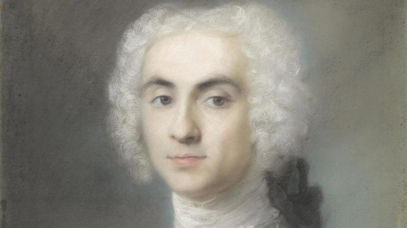
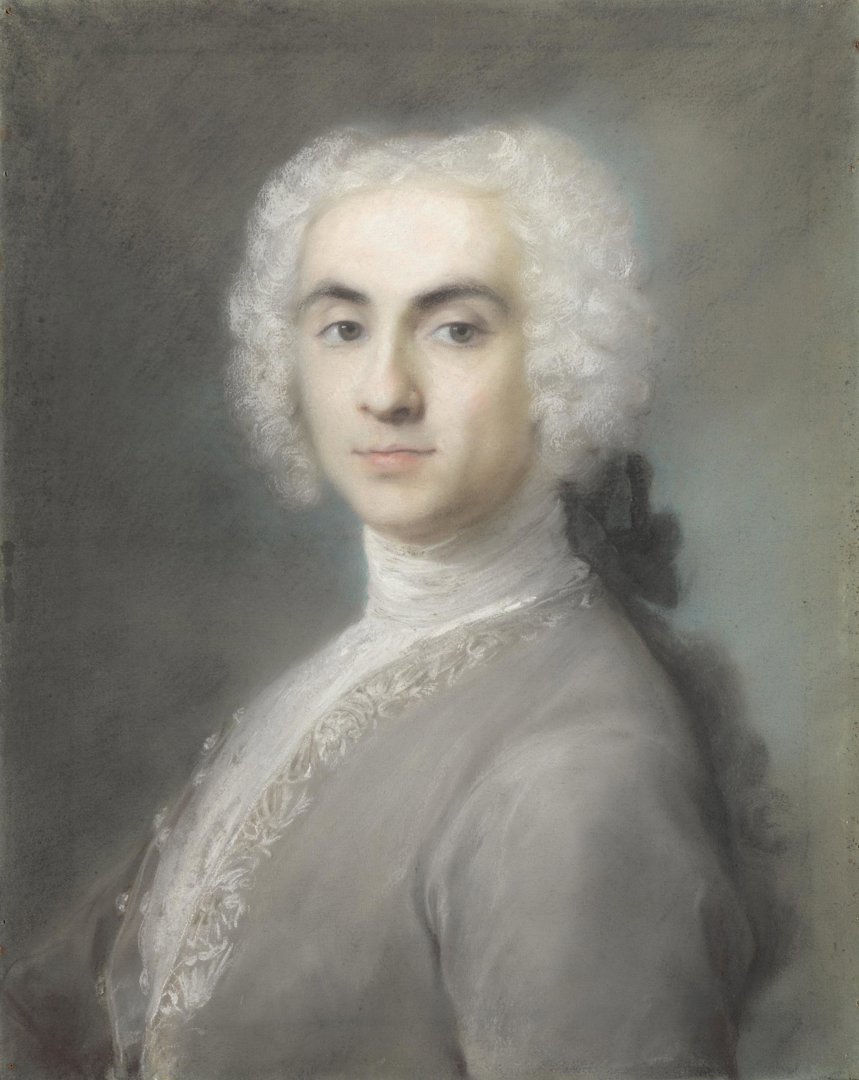
MIRANDA HINKLEY (in the studio): Venetian-born Rosalba Carriera was one of few women to make a successful career as an artist in the 18th century. She began by painting tiny pictures on ivory to decorate the inside of snuff-boxes, and by the time she was in her twenties had attracted an international clientele for her pastel portraits. The National Gallery’s collection includes a shimmering pastel of an unknown gentleman, that - after many decades in storage and quieter rooms - has recently moved to a prominent position in the main galleries.
Letizia Treves - Curator of Italian and Spanish Paintings 1600 to 1800 and Head of the Curatorial Department - introduced Cathy FitzGerald to Carriera’s 'Portrait of a Man'. Made in the 1720s, the work depicts a handsome young man in profile wearing a powdery white wig and silver-grey coat with embroidered brocade. Letizia began by pointing out the subtlety of its colour scheme.
LETIZIA TREVES: It’s a wonderfully luminous object and it’s this wonderful, almost monochromatic kind of harmony of greys and whites and the softness of the pastel, particularly this sort of blended quality of both the velvet coat and the powdered wig, which contrasts with the detail of the lace trim. She’s certainly one of the leading exponents in this medium.
CATHY FITZGERALD: What makes her so good?
LETIZIA TREVES: I think she understood the pastel medium so well. You know, the beauty of pastel is it’s a combination of colour and line and so you can create detail – a glint of an eye, a gleam on a button, but you can also create this wonderfully powdery feel and I think it’s something she really exploited using pastel in its dry form. Later on artists like Degas and Redon added water and then adapted the medium and experimented, but she used it in a dry manner and of course that’s very much suited to portraits – particularly Grand Tour portraits. You have fewer sittings, very little time, it’s not like oil paint, you don’t have to wait for it to dry between sittings, so it really suited the type of work she ended up doing, really.
CATHY FITZGERALD: And he’s actually been tucked away downstairs in the lower galleries until quite recently, hasn’t he, so this is the first time in a long while that he’s back up in the main rooms…
LETIZIA TREVES: That’s right, he hasn’t been on the main floor for about 50 years, which is amazing – I mean it’s such a high quality object. And earlier this year we changed the fabric in this room, Room 39 and I took that opportunity to re-hang the room and I decided it would be a good idea to bring him upstairs and put him alongside some view paintings and Longhi’s genre paintings and really show the variety of what was being produced in Venice at this time.
The pastel itself is very fragile – that’s probably why it hasn’t been on the main floor, it’s very sensitive to light – and that makes it very difficult to hang in the main galleries where you have a lot of natural light, but I took the decision earlier this year to close the skylights here, like we do in Room 46 where the Degas pastels are and I was very keen also to unify this room. This room’s always been rather a challenge for the curator of this area because half of it’s Spanish with Goya and half of it’s Venetian, and I think Rosalba’s pastel has this wonderful grey hues and it ties in with the portrait of Peral by Goya on the other side.
CATHY FITZGERALD: Ah yes, which also has very silvery grey tones…
LETIZIA TREVES: Exactly, exactly.
CATHY FITZGERALD: So it’s a cunning way of bringing together Venice and Spain?
LETIZIA TREVES: Indeed. Trying to link two schools, which are not easily linked in another way.
MIRANDA HINKLEY (in the studio): Letizia Treves. And if you’d like to see Rosalba Carriera’s 'Portrait of a Man' - and Letizia’s cunning re-hang - pay a visit to Room 39.
That’s it for this episode. If you’re visiting don’t forget we’re open 10 'til 6 daily and 'til 9 on Fridays. Until next time, goodbye!