
Episode 37
The National Gallery Podcast
In the November 2009 podcast, curator's introduction: 'Sacred Made Real' (with Xavier Bray). Plus listen to art on the 'Sounds of the Gallery tour, and get a beginner's guide to painting in gold.
As a bonus, listen to an extract from ‘The Sacred Made Real’ audio guide.
15 min 39 sec | November 2009
Miranda Hinkley (in the studio): Hello. I’m Miranda Hinkley and this is the National Gallery Podcast. In this month’s episode…
[The sound of birds chirping: an extract from Chris Watson’s sound piece]
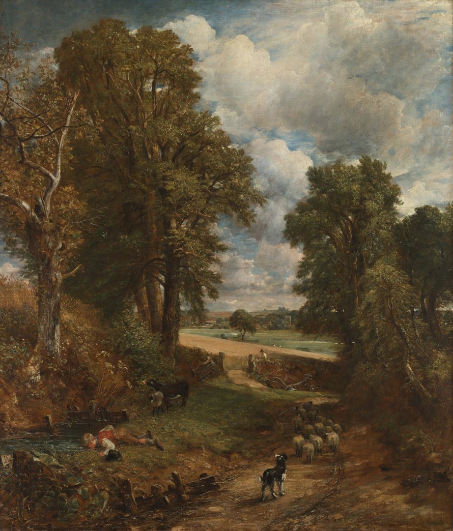
… a chance to hear as well as see Constable’s 'Cornfield'; and take a dog’s tooth, a ducat, and the yolk of an egg – science writer Philip Ball offers a beginner’s guide to working with gold leaf.
'The Sacred Made Real'
Miranda Hinkley (in the studio): And now to our current exhibition, The Sacred Made Real. Focusing on 17th-century religious art in Spain, this show gathers masterpieces by some of the country's best known names – artists like Velázquez, Zurbarán and Ribera. But it also reveals the brilliance of an art form, called polychrome sculpture, that's virtually unknown outside Spain. Made from carved and painted wood, these life-size depictions of Christ, the Virgin Mary and the saints are breathtakingly naturalistic and, as the new exhibition reveals, influenced the appearance of some of the most famous religious painting in the history of art. Leah Kharibian met curator Xavier Bray to find out more.
Leah Kharibian: Well, Xavier, we’re here in what will be the first room of ‘The Sacred Made Real’ while the exhibition is being hung and we’re standing in front of what is really a very beautiful sculpture depicting the young Virgin Mary. Could you describe her for us?
Xavier Bray: Yes, she’s exceptional, because she almost glows in the dark. She’s wearing this incredible drapery around her – she’s wearing a mantle that is gilded and then painted blue so that light sort of shines off it, and then within it she’s wearing this beautiful tunic. And then in almost direct contradiction to this celestial vision, you see a very beautiful young woman, her hair flowing over her shoulders and onto her back with her hand – well, first of all, her expression… she’s looking down, in a very sort of humble state, and at the same time she has brought her two hands together in prayer. So she’s meant to be this sort of personification of femininity and at the same time of faith, of dedication.
Leah Kharibian: And she’s made of carved wood, which is then painted. Could you describe a little bit about the process by which she was made?
Xavier Bray: She was carved, most probably by Montañés, and I have to say that this sculpture when we first saw it in Seville, she looked good, but she looks even better now. It’s just been restored for the exhibition, so it is almost certainly by Montañés himself…
Leah Kharibian: That’s Juan Martínez Montañés, who was one of the great sculptors, is that right?
Xavier Bray: Yes, that’s right. He was known as the god of wood and you can really see that in the way that the carving of the wood has been executed. He was a great virtuoso, so he would have carved it out of wood and covered it with jesso and it would have been completely white before being sent to a painter’s studio. Now we don’t know who the painter was here but he normally worked with Pacheco, and it would have been Pacheco’s responsibility to paint the flesh tones, the hair, to make them look as naturalistic as possible.
Leah Kharibian: Now the fact that there are two artists at work here – a sculptor and a painter – this you feel is really significant for Spanish art as a whole…
Xavier Bray: Yes, it’s… for me it’s fundamental, and for some reason it has been overlooked in the past, but painters because of this interaction – this direct interaction – with sculpture, I think must have inspired, or at least influenced them when they came to paint their paintings of the same subject. And that’s why we’ve put this sculpture, this wonderful sculpture, next to an early work by the young Velázquez of the Immaculate Conception.
Leah Kharibian: Now, Velázquez was quite intimately related to Pacheco, is that right?
Xavier Bray: That’s right. Pacheco was his teacher and Velázquez eventually married his daughter, Juana – he was really in there, as such. And he must have known Montañés, because Montañés kept sending his sculptures to Pacheco’s studio, so there’s a trio there that is working very intimately.
Leah Kharibian: And when we look at the Velázquez, how do you think sculpture has affected the way this picture looks?
Xavier Bray: Well, Velázquez is a fascinating painter, because very early on… well, he is trying to capture the reality as well as possible. And so instead of using an idealised face of the Virgin, he tends to… well, in this case, I think he’s using a real portrait, and it could even be Juana, his future wife. But it’s also the way he places the Virgin on the crescent moon and makes her so tangible, so palpable – you can reach out and almost take her out of the picture, or at least walk around her – he’s conceived her as if she were a sculpture and that is suggested especially by the way the drapery falls. So what Velázquez has done – he’s painted the blue mantel, but originally, and you can see this especially in X-rays, but even with the naked eye, is the way the blue mantel originally went right across the front of her red tunic and billowed in the wind. And in the end he decided to get rid of that and go for a very straight vertical. If you look back at the Montañés sculpture, that exact same detail is used.
Leah Kharibian: So looking at the two, the two works together, the sculpture and the painting, this seems like a really obvious point and it seems extraordinary that this point hasn’t been made before. Why do you think that is?
Xavier Bray: It’s a point that has been alluded to by art historians – they say yes, Montañés was doing that kind of thing – but it’s never really been seen together like this, and I think this is why we do exhibitions, to test out these visual ideas and to make them a reality. And in this case, there is a wonderful connection between the two – they’re not copying each other, it’s more of a sort of artistic, poetic response to one another. So I love standing in between them, exactly in the middle, and looking, for example, at the way the light falls on her hands and comparing that to the sculpture and the way that light falls on her hands. And there are these wonderful moments of fusion and that’s what this show is essentially about – not only contrasting painting and sculpture, but also showing how they inform each other, how they converse together.
Miranda Hinkley (in the studio): Xavier Bray. ‘The Sacred Made Real’ exhibition is open throughout the month. If you’re planning a visit, don’t forget to take the exhibition audio guide, available in English, Spanish and French. It was written by Leah Kharibian and features interviews with curator Xavier Bray. A combined exhibition and audio-guide ticket costs £11 and is available from the Gallery or online with a booking fee at www.nationalgallery.org.uk.
'Sounds of the Gallery': Chris Watson
Miranda Hinkley (in the studio): Now: from one audio guide to another. When was the last time you 'listened' to a painting? This month sees the launch of an unusual new tour that lets visitors do just that. It’s the creation of a group of students and artists, who have made sound pieces inspired by great works in the collection. The leading wildlife recordist, Chris Watson, whose TV credits include David Attenborough’s 'The Life of Birds', is among the contributors – and earlier he told us why he took Constable’s Cornfield as the inspiration for his piece.
Chris Watson: What caught my ear, looking at this painting… I was imagining as much as I could, Constable in his studio in London, re-visioning this painting, maybe from childhood and it’s so full of memory the painting, even though, you know, it has to be a contemporary scene. But it’s something that… you know, I’m sure he did that – I’m sure he lay down, pushed his face into some clear cool spring water on his way to school or on the way home and had a drink. You know, you can imagine yourself from this point of view looking out across the landscape of that woodland. Very physical sensation you can feel, looking at the painting, and feeling the sound and the wind on your back.
And the great thing with sound design for a painting such as this is that you can let the sounds drift and fade in the same way that you would gaze around, and then suddenly find something to catch your eye, like that patch of corn behind what appears to me to be a dying birch tree. I can hear that dry crackle and rasp, and also something that you would, you know, associate with the dead twigs and leaves around that tree as well. And those greater wafting sounds… that wonderful sigh and hiss of the wind sort of billowing through the leaves of the mature trees.
And also again the boy being attracted not only by the water but I’m sure by the sound of it. It’s something that we all find intriguing… that beautiful sort of silvery trickle of sound of water which would be very enticing on a hot summer’s day, like that, to go and bathe your face in and drink in. And then that gradual sense of distant perspective, which we’re these days not that fortunate to enjoy because of noise pollution, but we can hear sounds way off into the distance – that hiss and sigh of the ripe corn seed heads and maybe a distant sky lark, which I wanted to include in this piece. I could almost imagine it singing out of sight, way up towards those distant clouds.
And then that very distant suggestion, almost dream-like… I could imagine Constable gazing out across that field and imagining hearing a distant church clock tower in the distance. Something that we would never hear these days because of the way our landscape is suffused unfortunately with noise pollution.
My idea was to – and I presume this is one of the aims of the project – to get people to engage with paintings for a longer period, and using sound, I think, is a really beautiful way of doing that. It’s a snapshot of a few moments, a few minutes that happened several centuries ago.
Miranda Hinkley (in the studio): Thanks to Chris Watson. 'Sounds of the Gallery' is available from audio guide desks, and features work by students from the Ravensbourne College of Design and Communication, as well as sound artists Jem Finer, Simon Fisher Turner, and David Toop.
Gold
Miranda Hinkley (in the studio): Visitors to the Sainsbury Wing – the area of the Gallery devoted to the earliest works in the collection – are often struck by the ubiquitous use of one particular colour. Painting after painting glitters with gold, one of the most costly, prized, and difficult substances to work with in the history of art. To find out more, I spoke to Philip Ball, whose book, 'Bright Earth', explores how artists have used colour through the ages. We met in front of The Conversion of Saint Hubert – a 15th-century work depicting the saint kneeling beneath a sky of gold – and I began by asking Philip how the extraordinary effect would have been created.
Philip Ball: It was generally applied as gold leaf, so very very thin gold foil. So people would take – they would actually take gold coins – they would literally take coinage, there was no law against doing that then and they would hammer them and flatten them out into sheets, and just keep hammering and hammering away until the gold was almost transparent it was so thin. It was really sort of gossamer thin. And in fact for gold leaf in the Middle Ages a typical thickness is something like only about 2,000 atoms of gold thick, so incredibly thin. So you could get from a single ducat, a florin, a gold coin in medieval Italy, you could typically get maybe 100 or 150 pieces of gold leaf measuring typically something like 5 to 8 inches square.
The panel was first of all prepared in several layers and before the gold was applied typically the painter would apply a red or reddish brown underlayer and part of the reason for that was that because the gold was so thin, because it was transparent, if you put it on white, it actually looked a little sort of greenish. The brown actually shows through the gold sufficiently to give it this rich reddish colour that was what people were after, so…
Miranda Hinkley: You can actually see that here, on the halo there are certain areas where you can see this really strong reddy brown terracotta colour coming through.
Philip Ball: There are areas here where it looks as though the gold has actually been worn away and you can see the underlayers. So it would be stuck there typically by egg white, by a substance called glare, so egg white mixed with a little bit of water, and that would just be painted over the brown layer and then the gold leaf would be laid down very, very carefully on top of that. It is a very delicate process – anyone who’s ever handled gold leaf very quickly finds out how difficult this stuff is to handle. It sticks to everything, so you had to be quite skilful to be able to apply this stuff…
Miranda Hinkley: And not end up with it all over your tools and your fingers rather than the canvas…
Philip Ball: Exactly. Which is always what’s happened to me when I tried to do it. But once it’s down on the surface, these wooden surfaces even though they might look quite smooth once they’ve been painted with the underlayers, actually there’s lots of little pits and crevices in them and so the gold would stick into all of those and it would look… it wouldn’t look very shiny… it would look a little flat, a little matt, and so to get a shiny surface, the artist would then burnish the gold and this meant rubbing it very gently with a hard object, often a stone, or often actually a tooth, a dog’s tooth was sometimes recommended for this. And this would just smooth down the surface and so that you got this shiny layer.
Miranda Hinkley: So why, Philip, did gold stop being used so much in art works? Because one thing that you notice as you move out of this particular wing is that there’s just a lot less of it.
Philip Ball: Well, in the Middle Ages the main reason gold was used was symbolic. If you were making an altarpiece, as many of these paintings are, and as this picture of Saint Hubert is, then you would want to use the most precious materials to make it an offering to God. But towards the end of the Middle Ages and the beginning of the Renaissance, artists began to be less concerned about those symbolic values and more and more concerned with rendering things as they saw them. And the trouble with gold, if you look at gold leaf, it’s not actually how golden objects tend to look. And this was something that was commented on by Leon Battista Alberti, one of the key art theorists of the early Renaissance in Florence, and he recommended that artists really ought to set aside their gold leaf and start trying to represent golden objects using pigments, so browns and yellows and whites. And he pointed out that if you used gold leaf, the problem was that you were then at the mercy of how the light was falling on the object. You might want the gold to look very bright and shiny, but if the light wasn’t right, it could actually look quite dull, particularly if it was in a church only lit with candlelight. So you could get a much more reliable appearance of gold if you used pigment, so that was really the motivation behind this changeover.
Miranda Hinkley (in the studio): Thanks to Philip Ball. That’s it for this episode. If you’re in London during November, do pop in – you can visit the permanent collection free of charge, and we’re open 10 till 6 daily and 10 till 9 on Fridays.
Until next month, goodbye!